Create an infographic from your research
An infographic is a highly visual document that displays your research findings in a clear and visually appealing way.
An infographic is for you if...
- Your research contains a lot of statistics
- Your numbers lend themselves to telling a story
- You want to bring your data to life
Use it to engage with government bodies, end users, industry representatives, the general public and the media.
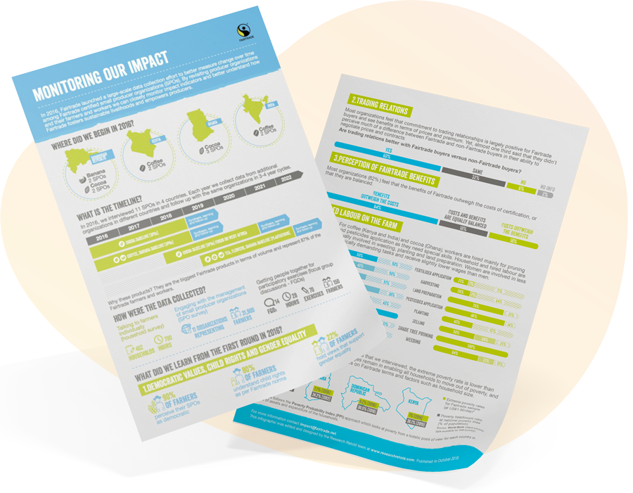
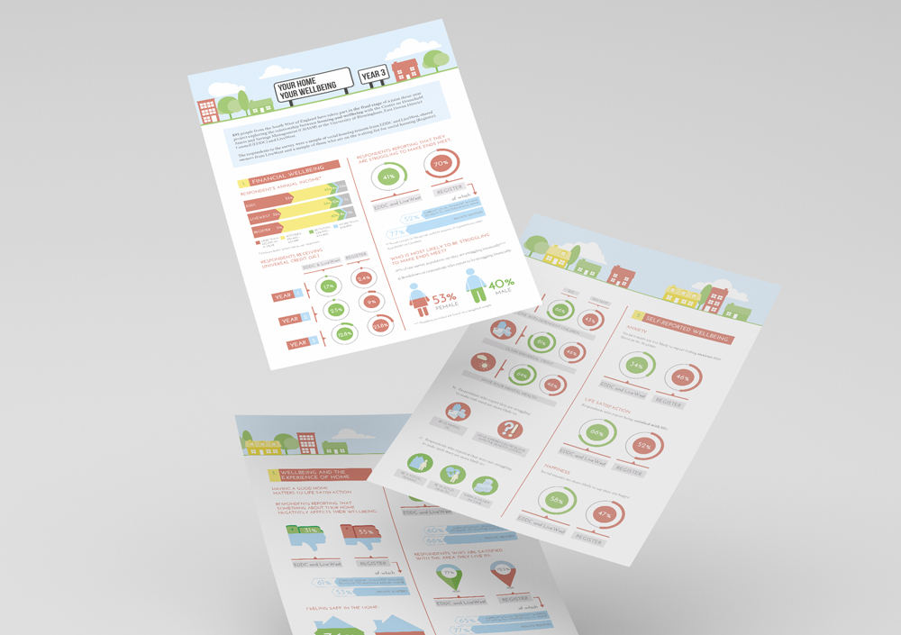
Infographics are one of our most effective storytelling tools.
By turning your research into an infographic you spark your audience’s interest and deliver knowledge instantly.
You can use an infographic to engage with government bodies, end users, industry representatives, the general public and the media.
‘An infographic is defined as a visualization of data or ideas that tries to convey complex information to an audience in a manner that can be quickly consumed and easily understood.’ (Smiciklas, 2012)
Turn your research into an infographic if you have a lot of data and you’re not sure how to best represent it in a meaningful way.
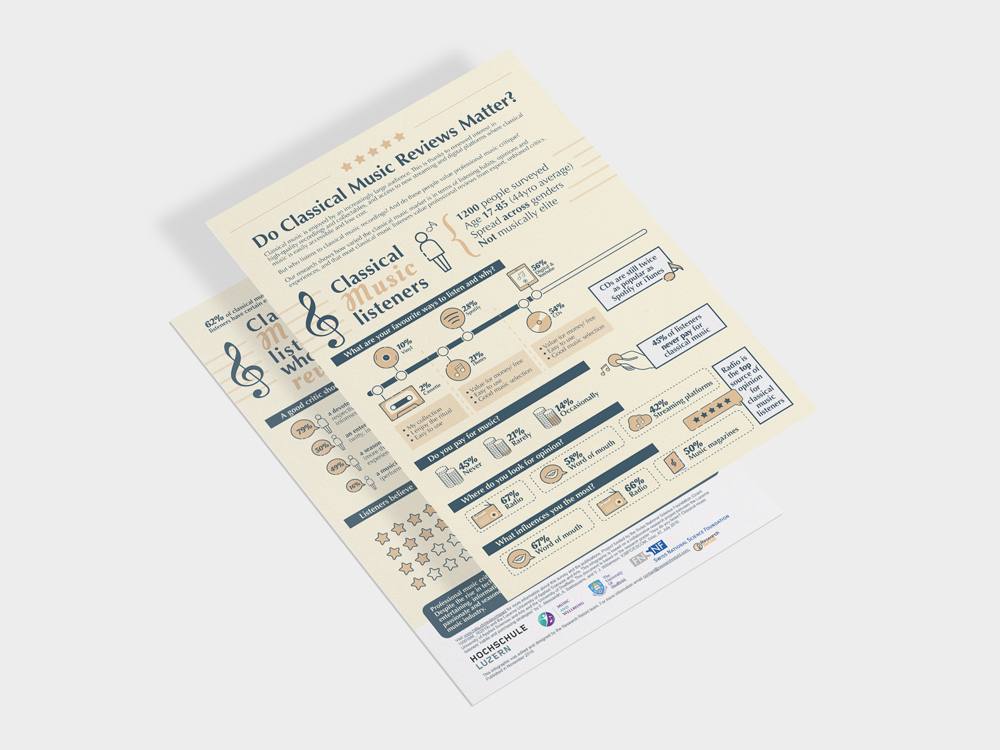
University: University of Sheffield
Topic: Classical music reviews
Audience: Industry magazines
2-page
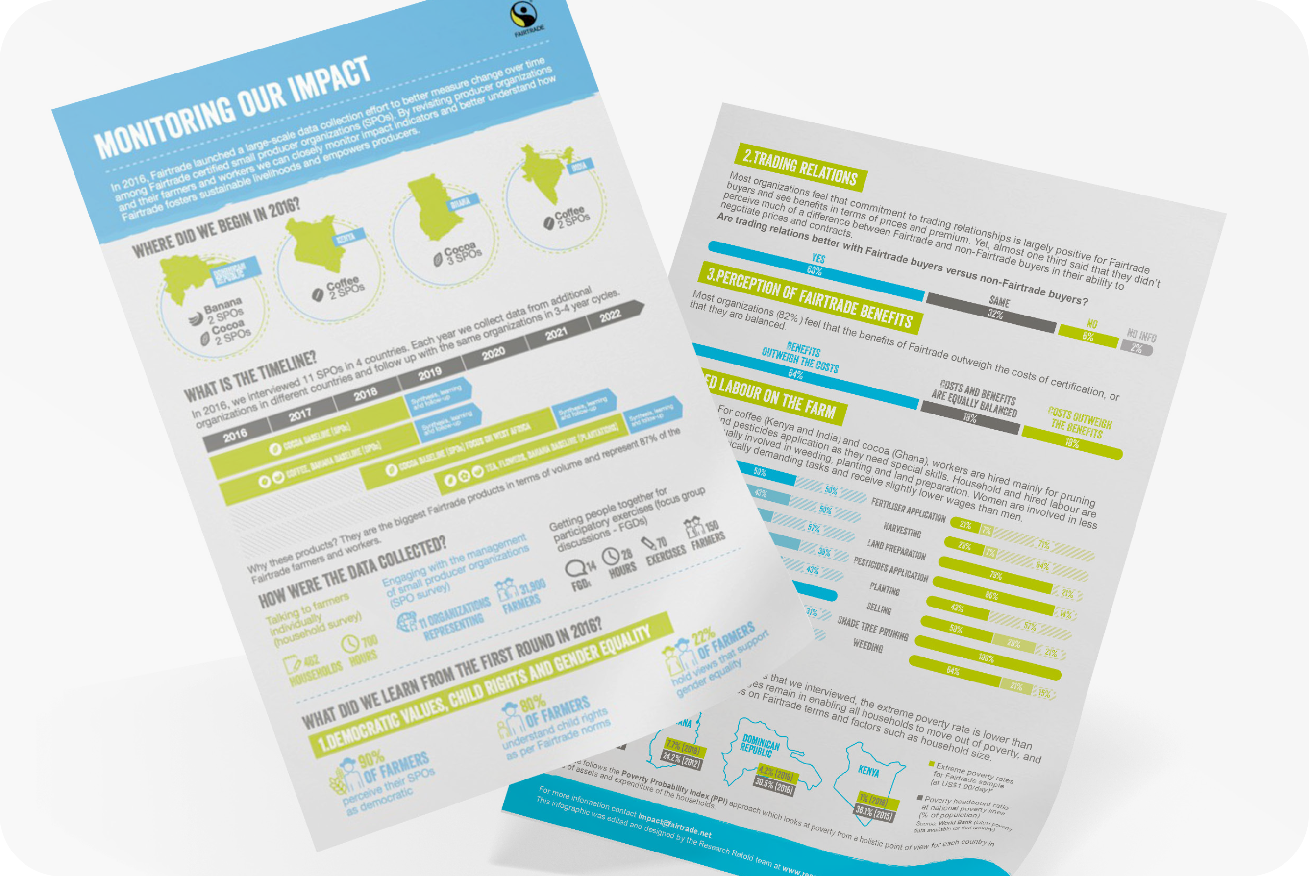
Organisation: Fairtrade International
Topic: Monitoring Fairtrade’s impact on farmer communities
Audience: General public, communities
2-page
Organisation: University of Sheffield
Topic: The effects of music on those with sleeping problems
Audience: Media, the general public
2-page

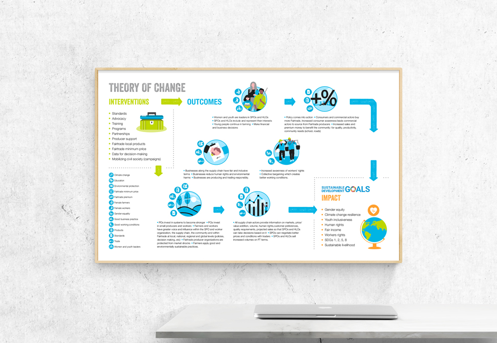
Organisation: Fairtrade International
Topic: Theory of change
Audience: Internal stakeholders
2-page
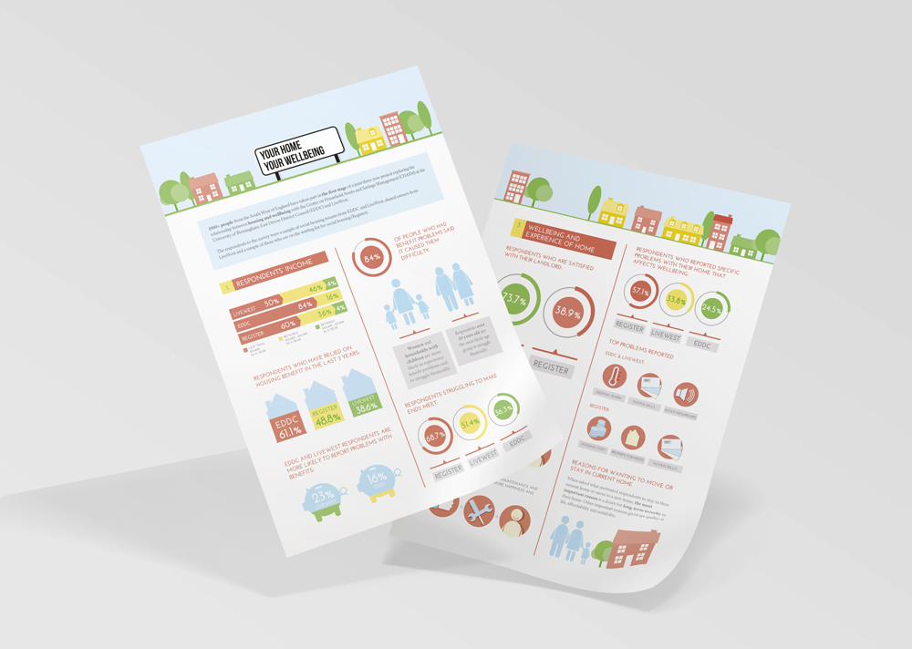
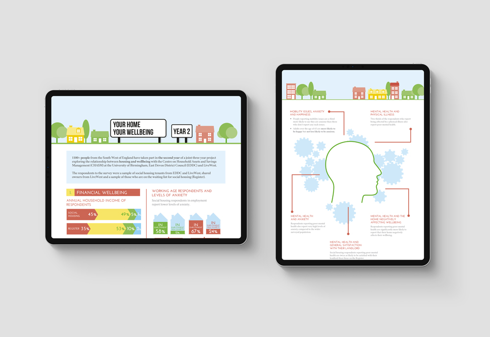
University: University of Birmingham
Topic: Social housing and wellbeing
Audience: Local government decision-makers
This example illustrates the continuous communication of results throughout the lifespan of a research project. Professor Lymer updated stakeholders yearly with a snapshot of the key findings using 4-page infographics. The target audience quickly absorbed what was going on without having to process a lot of information. The format also helped them navigate to the parts that were more useful for them, and identify what they wanted more information on.


Get in touch with us
Recent Posts
Bespoke workshop
Here is how we organised a bespoke workshop for the GreenPole research group in Stockholm.
Career paths after a PhD
Read about three different career paths after a PhD: doing a postdoc, transitioning to industry and entrepreneurship.
Telling a story with data
Read how we created a bespoke research communication course to help accounting researchers communicate their findings.
Making your research visible
Read how we created a bespoke research communication course to help accounting researchers communicate their findings.
Research communication course
Read how we created a bespoke research communication course to help accounting researchers communicate their findings.
Creating a policy brief series
In this blog, we share our experience of producing a policy brief series for the University of Durham of current issues impacting society.
Contact
contact@researchretold.com
+44 7501 704527
Follow us:
Privacy policy
Copyright © 2017-2023 Research Retold.
All rights reserved