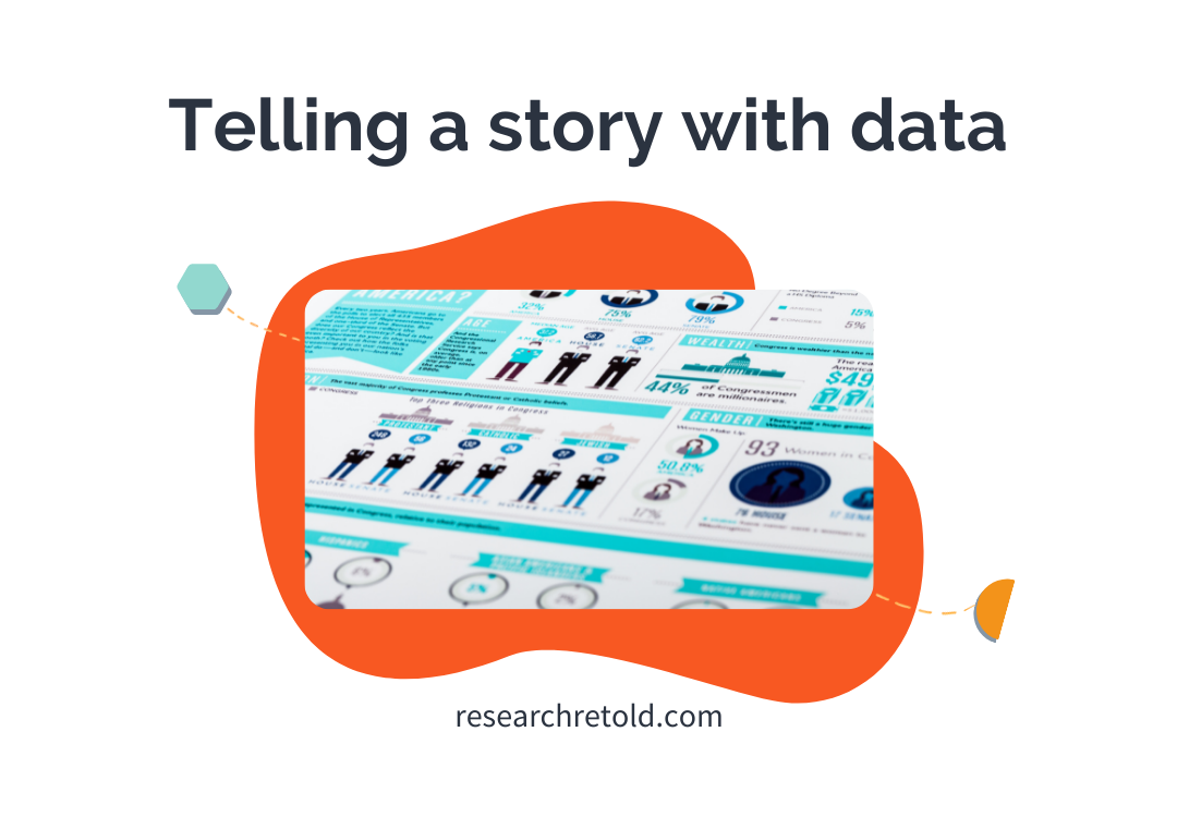
Have you ever been inspired by a good story? Stories tend to stick with us because we can connect with them emotionally. So, why not use them as a dissemination tool? This can be an excellent way to make your research more enjoyable and accessible to others. In this blog, we present arguments for telling a story with data and the elements you should consider.
![]()
Why tell a story with data?
Storytelling has been around for thousands of years. It was the first way to communicate knowledge and entertain ourselves, way before the written word. We are drawn to stories that move us and that spark our curiosity and imagination. Using a story to share your ideas makes them more memorable, persuasive and engaging (Dykes, 2016).
- Memorable: We process information differently when we are listening to a story in contrast with listening only to data. When focusing on data or information, the brain automatically goes into “critical” and “sceptical” mode to deal with factual arguments. On the other hand, when listening to stories, it drops its “intellectual guard” (Gottschall, 2012).
- Persuasive: Stories create an emotional response in the audience. It has been found that emotions have a greater impact on decision making than reasoning and logic (Lerner et al, 2014). Using data storytelling can compel your audience to take action based on the data you have analysed.
- Engaging: When you embed your data in a narrative structure, it is easier for your audience to understand both the big picture and why a particular insight is important (Dykes, 2016).
![]()
What is data storytelling?
Telling a story with data, or “data storytelling”, refers to communicating the insights extracted from a data set using visualisations embedded in a narrative that provides context, inspires action or drives change.
Let’s break this down.
Data
Data is the basis for the insights and findings you want to share. Thoroughly analysing a complete and representative data set can provide interesting and useful stories. If you are still in the analysing stage, here are some possible starting points for creating a narrative around your data (Lucid Content Team):
- Comparisons and rankings: These can highlight correlations between variables or factors, and you can explain how or why they occur.
- Outlier data points: When looking at your data, you may find data points that do not behave as expected. Why is this? Maybe the cause is worth discussing.
- Counterintuitive surprises: Unexpected results from the analysis of your data can create catchy stories and also spark conversations. Have you found any in your research? Have you seen any “missing bullet holes” as Abraham Wald did?

Narrative
For building your narrative, consider what is the purpose of your story. Go beyond “what” is your message, and think more about “why” you want to communicate it. Next, reflect on who your audience is. What stories are they attracted to? What new angle can you share with them? Having these ideas in mind will help you integrate the following elements (Cote, 2021):
- Characters: Who or what is the protagonist of your story?
- Setting: In what context do these characters interact/exist?
- Conflict: Describe a challenge or conflict that the characters are going through. What is happening?
- Resolution: What is the solution to the conflict? How did they overcome the challenge? How can you relate this to the insights you generated from your data?
- Call to action: What do you want your audience to do after listening to your story? Is there any moral to the fable?

Visualisations
Visualisations are used to reinforce your story. They can range from charts, graphs, maps, images… you name it (here are more examples). It is important that you carefully consider the type of visual so that they are impactful but not misleading. Here are some tips on what to do and what to avoid with your visual material when telling a story with your data (Krum, 2014):
DOs
- Be accurate: Make sure the data matches the visualisation or the message you are presenting. For example, if you are using a pie chart all pieces must add 100%. Otherwise, you demonstrate a lack of understanding of the dataset.
- Be data transparent: Share your data sources and origin. Being open about how you reached your conclusions increases your credibility and invites others to “replicate your results”.
- Include contact details: By including a way to contact you, the author, you can make sure your audience has a way to give you feedback or start a conversation.
DON’Ts
- Use the same visualisation type multiple times: It can make it hard to tell them apart, making them less impactful.

Now you have all the pieces for becoming a great data storyteller and telling a story with your data! We hope this blog helped you to use your data to create a story. For more tips read our post on “How to create compelling and impactful presentations”.
Many thanks to our Research Communicator, Phebe Bonilla, for writing this blog post.
References
- Cote, Catherine (2021) “Data storytelling: How to effectively tell a story with data” Harvard Business School Online’s Business Insights Blog.
- Dykes, Brent (2016) “Data Storytelling: The Essential Data Science Skill Everyone Needs”, Forbes
- Gottschall, Jonathan (2012) “Why Storytelling Is The Ultimate Weapon”. Fast Company
- Krum, Randy (2014) “Cool Infographics: Effective Communication with Data Visualization and Design”. Wiley. ISBN: 978-1-118-58230-5
- Lerner, Jennifer S., Li, Ye, Valdesolo, Piercarlo, Kassam, Karim (2014) “Emotion and Decision Making” Manuscript submitted for publication in the Annual Review of Psychology.
- LucidChart. “How to tell a story with data”
