
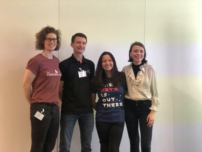
In this blog, we share our experience of attending and presenting at the Tableau User Group Yorkshire event in Leeds.
The event took place on Tuesday, the 4th of June at Horizon Leeds.

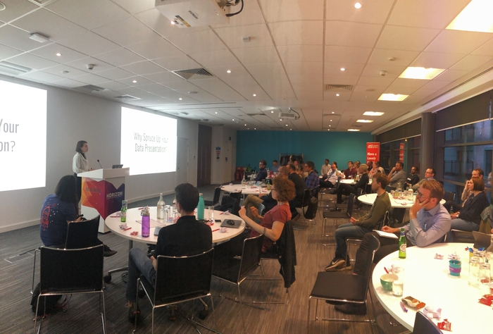
Now on its third instalment, this Tableau User Group Yorkshire event (#TUGY on Twitter) brought together Tableau enthusiasts and newbies from across Yorkshire. Organised by Jet2, the events are typically casual and friendly, with informative talks from various speakers and networking opportunities over pizza and beer.
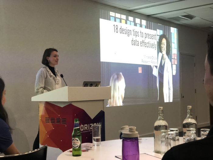
Founder and director of Research Retold, Mihaela Gruia, was among the lineup of speakers for the Tableau User Group Yorkshire event. Her talk, titled ‘18 Simple Design Ideas For Effective Data Presentation’, was the last after the two other speakers and Tableau experts:
- Steve Taylor from InterWorks Europe – ‘Let’s Try and Be More Inclusive – On the Much Overlooked: INCLUDE LUD Calculation’
- Adi McCrea from The Data School UK – ‘Spatial Data Tells Special Stories: Learn How to Tell Yours’
Why Spruce Up Your Data Presentation?
Mihaela kicked off her presentation with three important reasons for putting the effort into presenting your data in engaging ways:
1. Avoiding people falling asleep
We’ve all been there, attending weak presentations that do not engage us and leave us feeling deflated and unenergised.
via GIPHY
2. Avoiding the kiss of death
For a speaker, the eye roll is like the kiss of death. When that happens you have about 3 seconds before people clock out and start checking their Twitter feed.
via GIPHY
3. Avoiding the endless scroll
We’re all guilty of being on our phone while someone is presenting. As a presenter, you can capture imagination and attention so don’t waste that.
via GIPHY
Presenting data effectively
While we can’t cover all 18 tips in this post, we want to share with you 3 tips for presenting data effectively:
1. Make your materials colour-blind friendly
There are many colour blindness tools available online to help you be more accessible. Keep in mind that people experience your presentation in different ways and colour plays a huge role in their understanding.
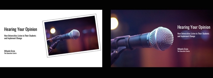
2. Align the text with the direction of an image
This relates to the power of the eye gaze when it comes to working with photos with directionality and people. Humans have the tendency to follow the direction of the photo. Like in this example, people in the TUGY audience preferred the photo on the right:
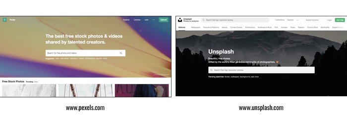
3. Use images in your reporting
Images tend to be the weakest areas of research reporting (Evergreen, 2011). But you may ask yourself where to find copyright-free photos?
Here are two libraries that we’d recommend starting with and that we use frequently: Unsplash and Pexels.
However, don’t be afraid to invest in paid options, especially for projects that allow that budget. As you know, a good photo speaks 1000 words.
Presenting Data at the Tableau User Group Yorkshire event in Leeds
Mihaela’s 20-minute talk covered simple design ideas to spruce up a presentation and give presenters confidence that their materials grab the attention they deserve.
The design ideas covered presentation slides, reports and graphs, as well as colour and font considerations. Moreover, she gave the audience actionable tips to communicate better with their teams.
Mihaela also conducted a simple experiment called the Stroop Test (special thanks to the two audience members who volunteered!). The Stroop test is effective at demonstrating the dominance of our eyes in interpreting the world.
In the first round, the candidates were timed to read 16 coloured words out loud, where the colour of the word coincided with the text displayed on the word. In the second round, the colour and text were conflicting which caused a brain processing delay (and some laughter from the audience). You can take the Stroop Test online if you are interested 🙂
Throughout her talk, Mihaela emphasised the importance of taking the time to craft and personalise presentation materials. Or what one of the speakers, Adi, described as ‘moving away from the default’.
We previously shared insights on our blog about presenting research to a nonacademic audience, covering simple, effective tips.
Lastly, Mihaela concluded her presentation by leaving the audience with one of the most useful tips:
‘Visuals are a support tool — not a replacement for the speaker.’
Overall, the Tableau User Group Yorkshire was a superbly organised event, with great people and lots of interesting takeaways and insights. Special thanks to Joanna Hemingway, Data Viz Lead at Jet2, and to Jet2.com and Jet2holidays for organising the event for the community and for having us.
This blogpost was written by Isabel Regino, now Head of Marketing at Research Retold. If you’re curious, you can read more about Isabel’s journey with us.