
In this blog, Josephine Haagen shares her top six tips for making research accessible.
Josephine is a recent Liberal Arts graduate from the University of Leeds, and she is passionate about research communication and working with data.
![]()
Research and accessible communication
In 1995, the Disability Discrimination Act was passed in parliament, paving the way for a number of protections for disabled people in their everyday lives. Today, 25 years later, it’s worth taking stock of the ways we can make our work more accessible to the 14 million disabled people in the UK, who make up 20% of the country’s working-age adults.
With today’s reliance on technology to receive information and disseminate research, we can adapt aspects of our work to ensure it can be accessed by people with disabilities. The world of accessible communication is constantly changing and improving and it’s our responsibility to stay abreast of the changes if we want our work to be inclusive.
The aim of this blog post is to provide 6 top tips to help you disseminate research in a more accessible way. The tips are adapted from the UK government advice on accessible communication.
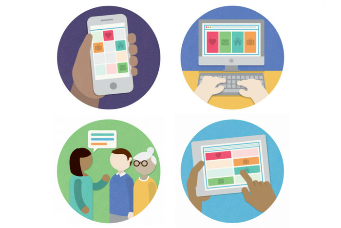
Image source: Civil Service, “Top tips for accessible communications” (Accessed Nov 2020)
Making research accessible: Text
1. Keep text clear, concise and formatted simply
Making research accessible can often be just a matter of font and formatting. For example, keep a large-text copy of your work on hand, in case someone asks for it. Large text (above size 16 font) helps people who are visually impaired or have learning disabilities.
Similarly, densely formatted text can be hard to read, so choose either a widely spaced font (Calibri, Helvetica, Arial) or manually edit the spacing of your text. For example, double-spaced paragraphs are easiest to read, as they lessen the level of visual stress on the page.
- For emphasis use bold text
- Underlining can be mistaken for hyperlinks
- Italics can be difficult to read
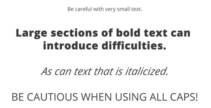
Image from WebAIM
2. Include a simplified summary
It can be helpful to attach a summary of your research that is concise, avoids jargon, and has less visual stress (Research Retold can help with this!).
Some word processors, like Microsoft Word, have an in-program accessibility checker that can create suggestions based on your work. In addition, design programmes have the option to create ‘screen-reader’ friendly documents so be sure to check what options you have.
Making research accessible: Visuals
3. Add alternative text to images
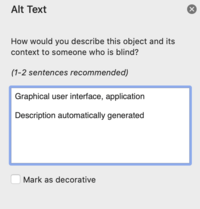
A significant step to making visuals accessible is to attach alternative text (alt text) that describes its contents.
Alt text helps people who can’t see the screen understand what’s important about the image you’re including – good alt text is succinct and accurate; it presents all the relevant information that would be gathered from someone seeing the image for themselves.
Many platforms have alt text built into them. For example, when you upload an image on Twitter, Facebook, or Instagram there’s a button that allows you to add alt text. Let’s see some examples.
Adding alt text on Twitter
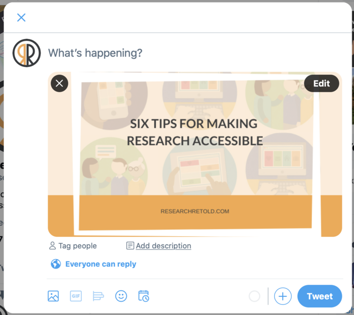
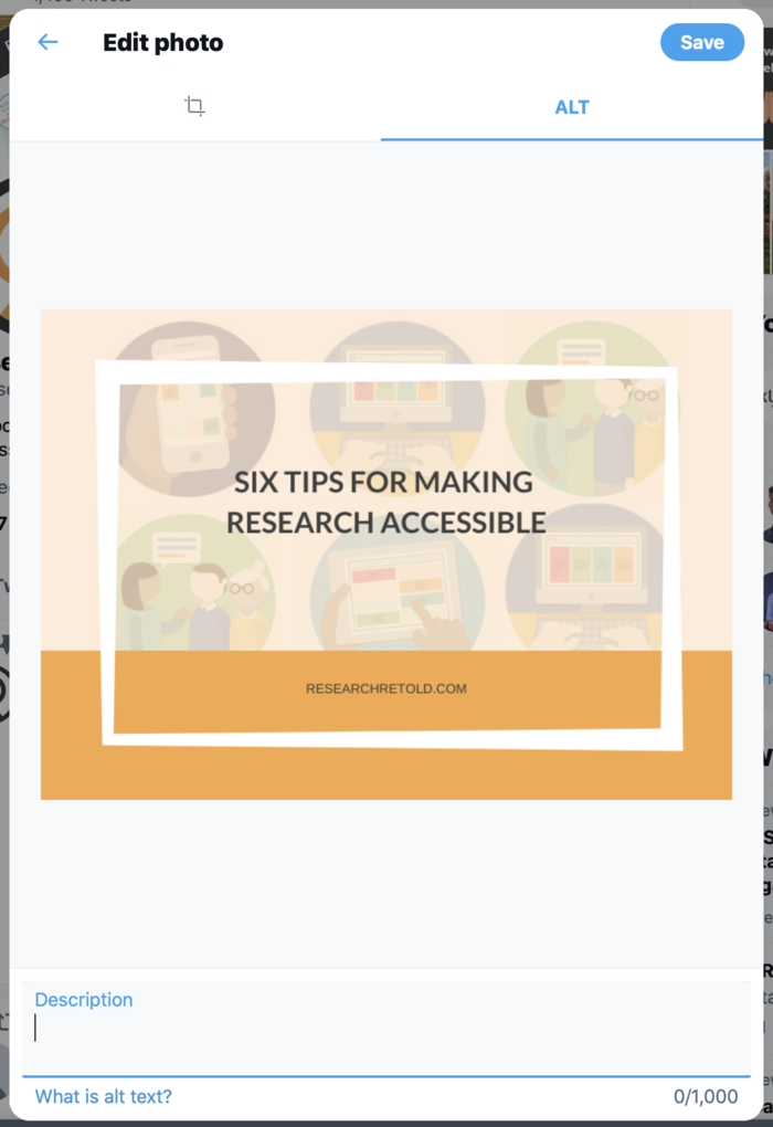
When you add a photo on Twitter, you have a button underneath the photo that says ‘Add description’. If you click that you see the below. In the description box at the bottom, you can add 1000-characters to describe your image.
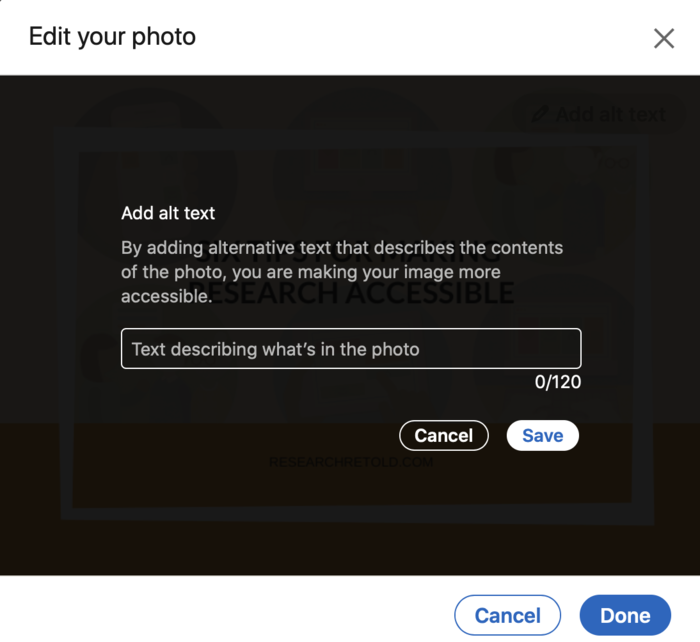
Adding alt text on LinkedIn
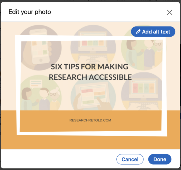
When you upload a photo on LinkedIn, you have a blue button that says ‘Add alt text’ in the top right corner. Click it and you get this – you have 120 characters to describe your image.
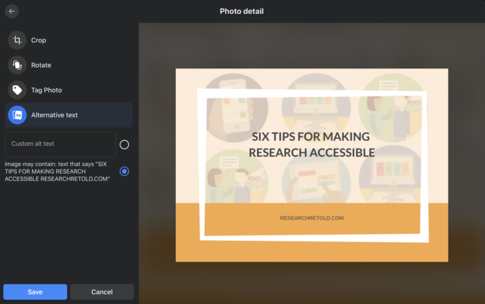
Adding alt text on Facebook
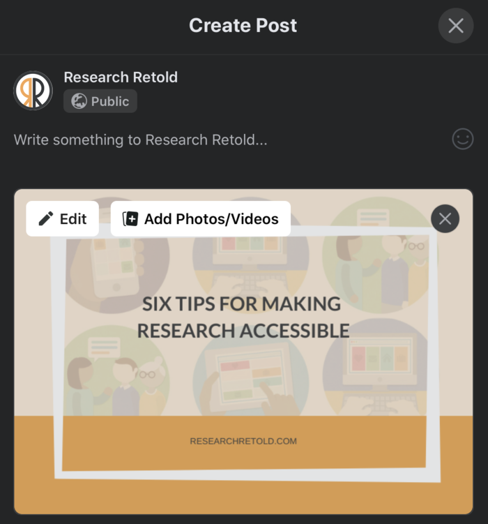
When you upload a photo on Facebook, you have a blue button that says ‘Edit’ in the top left corner. Click it and you get this panel open on the left – you can add custom text or Facebook is helpful and populates the text box for you.
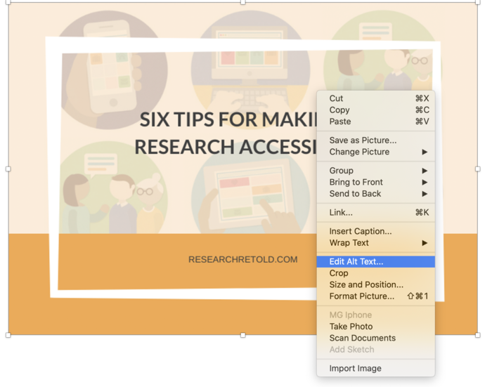
Adding alt text in Word
Right-clicking on an image in Microsoft Word brings up an option that says ‘edit alt text’.
How to write good alt text?
WebAIM has a good guide on writing the best alt text, as well as how to write it into HTML on self-published websites. This applies to graphs and charts too. Write a brief statement that describes what your audience is looking at.
4. Consider colour contrasts
As a general rule for the best contrast, place dark types and images against a light background. In-program accessibility checkers can help discern whether the level of contrast makes your text and visuals easy to see.
Moreover, avoid using colour on its own to convey information. Use patterns or labelling to ensure that your audience can understand your thinking without having to differentiate between the colours presented to them.
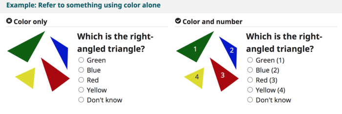
Image from WebAIM
Making research more accessible: Video and audio
5. Include subtitles on videos
Subtitling videos is the best way to make them accessible to hearing-impaired viewers. It’s a worthwhile effort whenever you create videos, as many people watch videos without sound by only reading the subtitles. To help with this, YouTube has created a guide to syncing closed captions to the videos you upload on their platform.
Additionally, visually impaired viewers may need a separate audio-description track that describes what is going on on-screen. This is especially the case if your video relies heavily on charts or images.
6. Provide a transcript
A good way to maximise the level of accessibility of audio or video content is to create a transcript. Basic transcripts contain the full script of the video written out. A descriptive transcript also includes text descriptions of the visual information required to understand the content. Viewers can refer back to it if they missed something, or to see if they’re interested.
Conclusion
In conclusion, making research accessible to the wider public involves small but significant steps.
This is worth doing as people become more interested in research and as researchers aim to disseminate their research to achieve impact.
The tips in this blog post are a small fraction of the ways you can adapt your research.
For more comprehensive resources and guides, visit the Web Accessibility Initiative and the UKAAF (UK Association for Accessible Formats).
Many thanks to Josephine for sharing these six top tips for making research more accessible. What other tips would you add to the list?