Late last year we decided it was time to create a fresh look and feel of our brand across all channels, including our website and social media. Rebranding Research Retold was exciting and equally tricky due to the pandemic limitations in place. The team had to be flexible and adapt to working remotely.
In this blog, our graphic designer, Sam, shares step-by-step what we went through to create our new brand and website Research Retold, our thinking process, tweaks and how we overcame obstacles on the way.
![]()
First steps
We started by having a look at the Research Retold website and identifying its strengths and weaknesses. Some key questions that stood out during this stage were:
- What’s the best image optimisation for the site?
- What do the developers need before they start working?
- What is the user journey?
- Does the new wireframe highlight and simplify the services provided?
The creative process
This was the part where we started working on the new look and feel of the brand. The creative process at this stage is always enjoyably messy. As with any new piece of creative work, it’s best to start with a blank canvas and let ideas run wild. The methodology I use to create a concise branded work is exploring diverse outcomes and then reducing them down to something more simple. So, while I had some guidance from Mihaela about the elements she wanted to keep of the old branding, I made sure I offered some alternatives too.
“I want to keep the original tone of voice and colours where possible. The two ‘R’s’ in the original logo and the orange are integral to the brand…” – Mihaela Gruia – Founder and director of Research Retold
Below are three final creative outcomes which show the new branding ideas. I always like to show things in situ as it’s important to demonstrate how they might function.
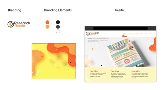
Branding concept 1
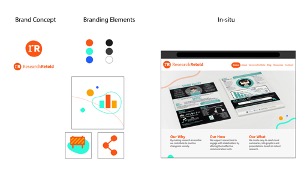
Branding concept 2
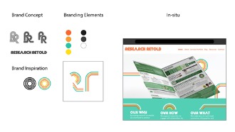
Branding concept 3
The creative direction that best reflected the original logo was chosen to proceed to the next stage of brand development. We tested the “mileage” of this concept in a document (below), which was a piece of speculative client work. We wanted to use it as a template or reference for the new brand.
“Create a document that is fresh and looks cool (like you).” – Mihaela Gruia – Project Owner
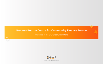
This use of ‘colour’ and branding ‘shapes’ would later serve as a covenant for the direction of the new brand ecosystem.
The new logo
As I continued working through the rest of the brand material, such as the website, marketing material templates and brand strategy, I simultaneously developed the overall brand logo and logo mark. The logo meant the most to Mihaela, and understandably required lots of meticulous iterations in making sure it was right for the brand. A richer, bolder orange was used to give the brand more energy – whilst also passing up-to-date accessibility guidelines for readability. A combination of Serif and Sans serif fonts echoed the transformation of research into contemporary visual language.
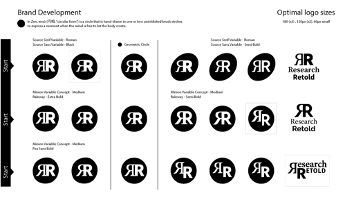
Branding development – Stage 1
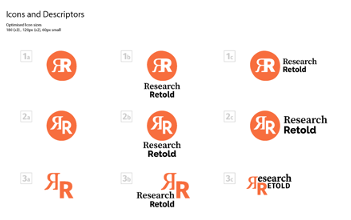
Branding development – Stage 2
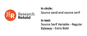
Branding development – Stage 3
The new brand
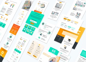
Developing the new brand aesthetics alongside the logo itself allowed me to work more holistically. I was able to harmonise all outcomes, arriving at a brand that really became the sum of all of its parts. This was demonstrated in a brand guideline, which will later be shared with the team, and any other third party working on internal branded work. 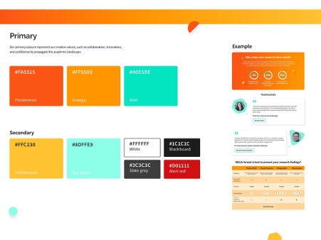
Remodelling the website
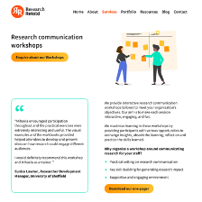
Designing the new website wireframe was fairly quick. Initially, we had decided to use the same original page content but with the new branding. However, after the first website audit, it became apparent that the original website was not very user friendly. In consequence, we worked on a more streamlined wireframe and I went about bringing in the new branding elements and colours to it.
The tools
I decided to use industry-leading UI/UX tools to put together the new wireframe, which consisted of a dozen or so pages. The programme Figma allowed me to create the website furniture – like buttons and typography (otherwise known as a ‘design system’) to more consistently build the website pages.
The challenges
The time I spent working with Mihaela and the developers of the website continued through the toughest time of the pandemic. This meant that, at stages, the team worked collectively in separate countries. We were getting closer and closer to completing the site. After a few iterations and amendments, we were about to have the site handed over to us. However, seeing the pages and new branding falling into place, we realised there was more work to be done. We needed to think more about the user journey. After all, a fresh site and new branding aren’t worth all the effort if the platform we are creating is complicated and/or lacks some important usability functions. I had become familiar with the processes employed within the “user-centred” design industry. We enlisted them to help us optimise the user interface and calibrate the page structure and user journey.
Defining the user journey
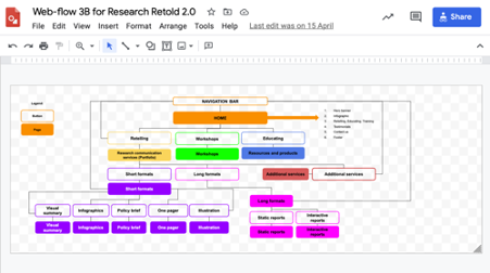
We worked through a lot of theory and client research to make sure that any changes to the new site would make it easier to navigate, as well as improve the demonstration of products and services. I worked closely with Mihaela and her team to organise the business’ ‘core’ products. I felt the best place to start the “website reshuffle” was reviewing Research Retold client testimonials and requests. After the analysis, we grouped the “core products and services” and categorised them into three clusters: ‘services’, ‘workshops’ ‘resources’.
Final tweaks
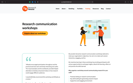
At this point in the process, we realised that one of our brand colours failed some important accessibility tests. This was another initial oversight in the design process. We encourage you to do these tests early in the branding development stage. The teal colour looked fluorescent on some screens. So, I undertook an in-depth colour contrast test of all the new brand colours. Finally, I was able to replace the teal with a less intense one. With this new colour palette, I had to revisit all the outcomes I had created, such as brand guidelines, social media assets, and the entire wireframe. Luckily, after the second audit of the site, I was able to work all of this into the new, more streamlined wireframe. In the end, the rebranded wireframe was ready to be handed over to the developers so that they can build the new site for us.
New web-safe brand colours.
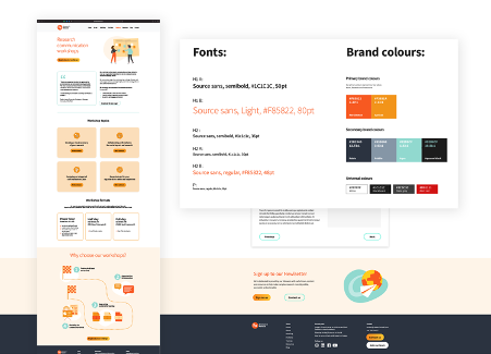
New web-safe brand colours across the wireframe and the brand guidelines.
What we learned
Rebranding is hard work. It does not only involve the looks of a project, but also a reevaluation of how the users or customers interact with you. Here are some of the key things that we learned and recommend you consider if you want to rebrand your project website.
Before rebranding
Re-evaluate the brand
- What does the design convey?
- Is that the message you want to get across?
Do an audit of the current website
- What is the user journey?
- Is it easy to understand what you do?
- Is it easy to access the services and products that you offer?
While rebranding
Creating a new brand
- What do you want to preserve from the current branding?
- What do you want to change?
- Do the logo and colours pass accessibility tests?
- Does the new design convey the message you want to get across?
Re-organising the website
- What do you want the user to experience/find?
- Is the new journey user-friendly?
- Does it include all the information you want to share in an easy-to-navigate way?
- What do you need to provide the site developers with so that they can start?
Thank you for following our journey! We are so happy to be able to now share our new brand and website.
We hope you find these tips useful, please let us know in the comments what other struggles you face and how you overcome them.
Many thanks to our Research Communicator, Phebe Bonilla, for writing this blog post.
