Do you have to create and give presentations in your line of work? Are you wondering how to create compelling and impactful presentations? Do you struggle when preparing?
These are some of the ideas addressed at the event “Master the art of communicating: A virtual online conference” organised by Apolitical for public servants and policymakers.
Our founder Mihaela Gruia was invited as a speaker for the Presentations session, along with Doug Hattaway, founder of Hattaway Communications. This organisation helps leaders use the power of strategy, science, and storytelling to achieve their goals
Here are the key ideas on how to make the narrative compelling and tips to create impactful visual presentations shared during the session.
How to create a compelling narrative?
Strategy
First of all, set clear objectives of what you want to accomplish with your presentation. What do you need your audience to know, feel and do? The mind and the heart of your audience must synchronise in order to follow your discourse. Also, think about what do you want them to do as a result of listening to you. Do you want to change their mind? Do you want them to take other actions or steps?
Think in narratives
Since humans developed language, we have learned about the world around us through stories. Thus, it is very natural to think in narratives. Think about your presentation as a narrative with a human story as the centre. If the audiences can reflect themselves in the protagonists it is more likely that they will connect with your message.
Bear in mind that the first thing you say about your topic will shape the perception of your message. So, prepare the stage for your key messages in a way that your audience can see the full picture and get a sense of coherence from your presentation.
Storytelling
Now, moving on to how to deliver your presentation, define the key messages you want your audience to take away from your presentation. This narrative framework will also help you to remember the complete message and to situate yourself when delivering the presentation. It can be particularly useful when you have a time limit.
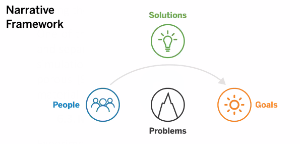
Make sure you are telling a strategic story with specific examples that can bring your message to life. Think about specific people (remember the human story factor?) in specific contexts. It is especially useful to mention three elements:
- the goals that person wants to achieve
- the challenges or problems
- the solutions to overcome them
In this way, your audience can know the full story and engage with your message.
*Diagram by Hattaway Communications
Creating impactful visual materials
Visual aids are crucial to create effective presentations. They can be very useful to emphasise key ideas and to make your presentation memorable. But, how can you create impactful visuals? How to find the right balance of content?
Since you have already thought about your strategy, goals and audience while creating the narrative, consider this: what will make my audience want to listen? What will they react to?
Create a structure or skeleton of your presentation based on your objective and your audiences. You can do a quick sketch on a piece of paper or a word document. Do it before you start putting the visual materials together. This will help you organise your content and avoid overcrowding your presentation. Remember, you can always give a handout or a follow-up link.
After carefully thinking about the content, it is time to get down to work. Here are three principles to create visual and impactful presentations.
1) Use a consistent colour scheme
Many organisations and institutions have branding guidelines. You can use these to your advantage to create a congruent image.
2) Include high-quality images
If you want your presentations to look more professional make sure you include high-quality images that convey your narrative and message more easily. There are many resources with copyright-free high-quality images, for example, Unsplash.
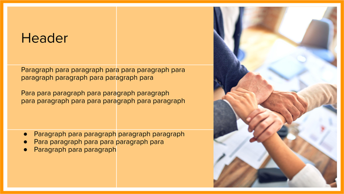
3) Position elements on the slides using a 3×3 grid
A very practical tip to create slides that are pleasing to the eye is to use the images in such a way that they take up 1 or 2 thirds of the available space. You can also use the same rule for text. Divide it into blocks of three. This will give the information a structure that is easy to follow. See examples in the images below:

Tips when including data in your presentations
Remember that presenting is an opportunity to change people’s minds. The way you present your information can sway their opinion and understanding. Always aim to tell the truth in a clear and understandable way. It is very easy to be misleading with visual materials when you want to emphasise something. Here are some tips to avoid creating deceiving material.
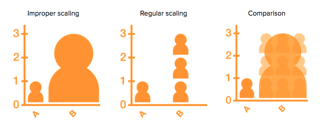
Use proper scaling
When comparing the size of two objects, make sure they are seen on a proper scale. In this example, follow the ‘regular scaling’ guidance.
Use the complete scale
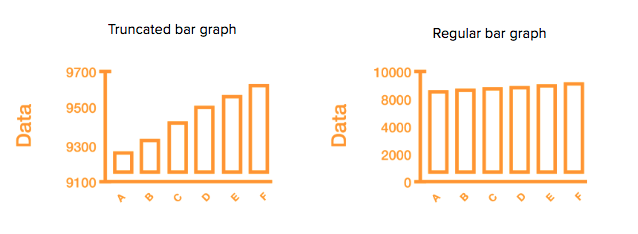
A trend can be seen as very stark if the scale is truncated, creating a false impression. It is better to use a complete depiction of the scale. Alternatively, you can use percentages or statistical errors.
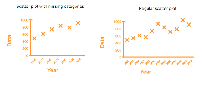
Use all datapoints
When omitting data, you can mislead your audience into thinking certain trends are there, which can be much more complex in reality. Offer the full picture, not just the one that suits your story.
Use active chart titles
By changing the titles of charts you can help your audience understand your message quicker. This will save them “thinking time” and allow them to focus on your narrative.
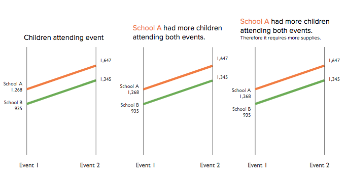
Use colour for emphasis
Using contrasting colours to draw attention to key ideas.
Avoid 3D graphics
These can be hard to process and also misleading due to scale and perspective.
Accessibility
Finally, make your presentations for people with disabilities. For example, there are tools that allow you to test if your work is accessible for blind-colour people, such as Colbindor.

We hope you find these tips on how to create compelling and impactful presentations useful. Do you have more ideas? Share them in the comments section!
Many thanks to our Research Communicator, Phebe Bonilla, for writing this blog post.
If you are interested in creating impactful visual material for your presentations contact us! Shoot an email to mihaela@researchretold.com.

