
This post explores the topic of creating a visual summary of your research findings.
We start by offering a definition of visual summaries and their use for research communication.
We then discuss how to plan ahead and organise your content, focusing on the key messages, visuals, and call to action.
Are you ready to find out how a visual summary can be useful for presenting research findings?
Let’s begin!
What are visual summaries?
You could associate visual summaries with the ‘Executive Summary’ or ‘Abstract’ of a research paper. See this example below from Tufte and Obregón’s article.
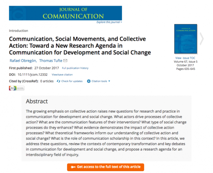
Image source: Wiley Online Library
Yet, the huge difference is that visual summaries include visuals to enhance the messaging and communicate the main points.
A visual summary doesn’t replace the report. Instead, it captures the essence of the research paper by drawing the reader in and calling them to action.
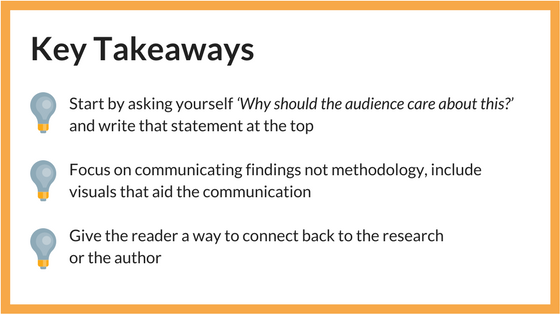
The focus of creating a visual summary of your research should be on communicating the findings and not elaborating on methodology-related aspects.
If the audience needs to know about specific details, you can answer in person or refer them to your report.
In some cases, visual summaries can integrate with the original full report. This may be challenging, however, if you need to abide by strict publishing guidelines. Instead, visual summaries can become extensions of main reports.
Creating a visual summary of your research can be very useful for face to face meetings. You can distribute your visual summary as s handout, offering the audience something to take home and reflect on. Online, you can post the visual summary on websites, linking back to the research, author’s profile, surveys etc.
Overall, visual summaries are great for presenting research to non-academic audiences, who lack time to read the full report. They help the reader navigate complex information by presenting key takeaways in an accessible way.
So how should we go about creating a visual summary of your latest research paper, report, dissertation or even PhD?
Steps to presenting research in a visual summary
1. Plan ahead and organise your content
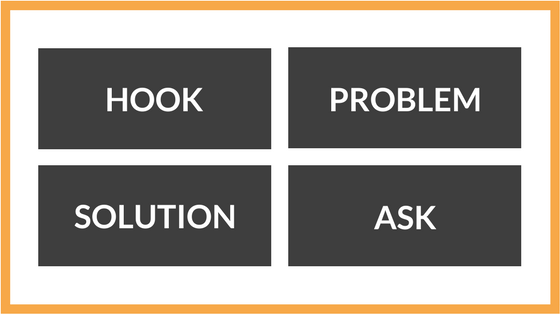
The first step to creating an effective visual summary is planning ahead and structuring information in a logical narrative. This simplified structure is a good starting point to create the visual summary and organise the content.
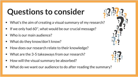
2. Focus on the key messages
It is challenging to distance ourselves from the project and offer the minimum amount of information. For example, when you need to present evidence and only have 10 minutes to deliver an important message.
A useful analogy relates to entrepreneurs (in this case the researchers) pitching to investors (in this case the policymakers or external non-academic audience). In that scenario, a 5-minute pitch follows a simple structure. In this case, the key is to structure the research message in a digestible and engaging format and offering the right amount of information that would lead to a further conversation. Putting ourselves in your audience’s shoes can help us realise how to allow room for follow-up.
3. Ensure the visuals enhance the text
Ensure the visuals used to enhance the text and are representative of your research. The aim here is to keep the designs simple and compatible with the research messages. A 2-page visual summary has limited space to produce complicated designs.
Therefore, the visuals range from icons and quotes to maps, charts or tables. Allow breathing room between the elements and allow the information to flow nicely on the page.
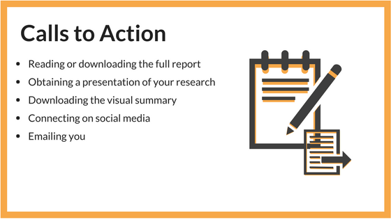
4. Include a call to action
Depending on the audience, strive to present research findings in context, reducing abstract language and making it actionable. It can be as simple as “Our research shows that X – this finding is useful in relation to X.”
So use the opportunity to connect with your audience by encouraging them to take action.
In conclusion, visual summaries are effective in presenting research findings. By keeping in mind the audience, the key messages, a few visual elements, and a call to action, you can create visual summaries to connect with non-academic audiences.
We talk about the step-by-step guide to producing a 2-page visual summary in our 32-page Guide to Communicating Research Beyond Academia.
This post is second in a 4-blog series on the main visual outputs useful for research communication:
Infographics || Policy Briefs || Illustrations and Infocomics