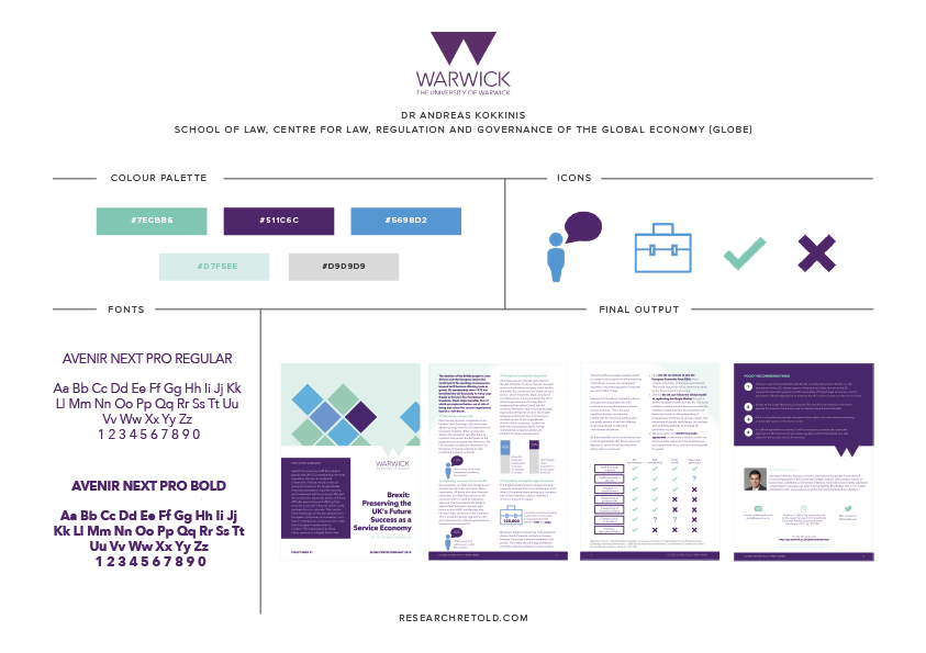
I was introduced to Dr Andreas Kokkinis and Dr Celine Tan from Warwick University after creating a 4-page visual summary on labour standards for Dr James Harrison. While impressed with the stand-alone document that was presented to policymakers in Brussels with great...
This post explores why research presented as illustrations and infocomics can be an effective communication tool. We discuss the definition of illustrations and infocomics and show examples from academia. Are you ready to find out how illustrations and infocomics can...
This blog focuses on four important aspects of writing policy briefs, offering practical examples of their structure. In contrast to infographics and visual summaries, the clue is in the name with policy briefs. The policy angle is key when producing a policy brief....
This post explores the topic of creating a visual summary of your research findings. We start by offering a definition of visual summaries and their use for research communication. We then discuss how to plan ahead and organise your content, focusing on the key...
Whenever I introduce my business to people and explain what we do, people immediately think about presenting research in infographics. And indeed infographics are one of the four research support products available to our clients. In this post we will cover their...
Each year approximately £6 billion are invested in research in the UK (UKRI). One problem is that the resulting research findings are under-utilised in decision-making processes because those who need to implement them don’t understand either a) the jargon and what...